CO2 Emissions of the Top 20 Most Populous Countries (Accessible Version)
Previously, I had completed a data visualization for my Google Data Analytics capstone project after completing a Federica Fragapane data viz course.
Proud of my new talents, and the job I just landed as a healthcare data analyst, I shared my project with my aunt, who spent her life as a marine biologist.
She has been embedded in the scientific research space for decades, surrounded by data visualizations, charts, graphs, and her work has taken her to many countries across the globe, to study their large bodies of water.
While I was expecting a pat on the back for my efforts, what she gave was the complete opposite. In her email back, she served up many constructive criticisms. She was honest in her feedback, no sugar-coating. Looking back, I am grateful for her feedback, as I used it as an opportunity to grow, improve, and learn about accessibility and its vital role in data visualization design.
Taking into consideration her suggestion, I reworked the visual.
Below you will find the latest version, which has accessible color palettes for the visually impaired, more readable fonts, and a host of other design improvements. Additionally, I have included her feedback, so you can compare and contrast.
My aunt's feedback:
1. CO2 Emissions per Country (Make the 2 a scientific subscript, aka: small and higher, like a squared number)
2. This visualization displays data on total annual CO2 emissions and per capita CO2 production for the top 20 countries in total population in 2019.
3. Delete the last sentence of the figure caption and label your X and Y axes. Somewhere spell out GDP. Your graphics may be seen by many different groups and some may not be familiar with the abbreviation GDP.
4. Convert population to millions to avoid so many numbers of the X axis. So, Thailand becomes 69.6 M.
5. Do the same with the total CO2 emissions in billions or trillions and GDP in trillions.
6. The two boxes that illustrate Per capita emissions in 2000 – 2019 were lower or higher look the same to me. I don’t understand.
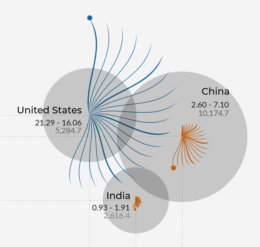
7. Tell your reader the wider line in the “feather diagrams” denotes 5 year intervals.
8. The “feather diagrams” for all the data for countries with less than $448,120 x 106 is lost. So, on a revamp perhaps you should try a triangle with a color gradient. That might show data for these less wealthy countries. How to scale a graph like the one you have is very difficult with numbers so very much larger/smaller. Biologists frequently use a log scale for this….either a log base 10 or a log base e (natural log).
9. Add a date to the Sources information indicating the last time you accessed this URL online. And of course your contact information Travis Tester, CEO, TT Analytics 😊
10. We talked about over all color pallet. Going forward be aware that some color pallets have been developed for color blind people (1 in 12 men but only 1 in 200 women).
11. Font – use a sanserif font for better presentation style. Calibri or Ariel.
Data Sources: ourdataworld.org; worldbank.org; knoema.com
A project by Travis Tester.
🎐 Instagram: instagram.com/travistester
🔖 LinkedIn: linkedin.com/in/travisjtester
Visual inspiration source: Federica Fragapane
Visual made while completing Federica Fragapane data viz course.
The New, Accessible Visualization

The Legend

The Details